


15 Must-Have Watercolors to Enhance Your Paintings

When you’ve shopped at the art supply store or browsed supplies online, have you ever felt like all the paint colors were too beautiful and it was impossible to choose?
Of course I enjoy browsing through a rainbow of watercolors. But throughout my years of painting, I’ve discovered that certain colors were the very best for bringing my imagination to life. I’ve experimented with many colors and brands over the years, and I finally narrowed down my favorites.
Other artists often ask what my favorite watercolors are. So today, I’m happy to show you the colors I use most often, and they’re all from Winsor & Newton and Daniel Smith. These are my go-tos! Whenever I use these colors, I feel confident that my work expresses exactly the mood I wanted it to express.
To build your own color palette, I suggest making color swatches. Just cut out small pieces of paper, paint one color on each piece, and be sure to show its range from dark to light. Then write the color’s name on the swatch. You’ll see my swatches as I show you my favorite watercolors below.
Yellows
When it comes to yellows and reds, I tend to choose saturated colors that pack a punch! These colors are more expensive than student-grade paints, but they’re worth it because even a tiny drop of paint goes a long way.
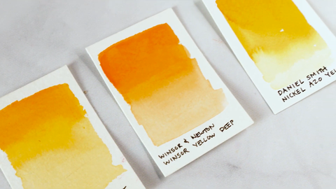
Winsor & Newton Cadmium Yellow Pale is my absolute favorite. It’s a sunny, vibrant sunflower color that’s full of pigmentation. I just love the warmth and light it adds to my paintings.
Winsor & Newton Winsor Yellow Deep is similar to orange, but in my opinion, it’s even better than orange because it’s so versatile. This color gives me plenty of flexibility, so I can easily mix several variations from it.
Daniel Smith Nickel Azo Yellow is less of an orange and more of a gold. It reminds me of the brilliance of a newly minted gold coin.
Reds

I have a special spot in my heart for reds because they truly make my art more passionate and alive. If you’re trying to find high-quality reds, you’ll do well with these two.
Winsor & Newton Winsor Red Deep has a blue undertone, like a ripe cherry. You’d be surprised by what just a little bit of this paint can do. You don’t need much of it to get beautiful saturation on your paper.
Winsor & Newton Cadmium Red Deep is more orangey in quality. Warm and punchy, this paint is the color of a fresh tomato. If you have both this and Winsor Red Deep, between the two of them, you can create a delightfully large range of reds.
Blues
I’m very particular about the blues I use in my work. Choosing the best blues is important because each of these blues conveys a distinct mood.
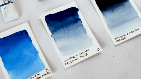
Winsor & Newton Winsor Blue (Green Shade) is a punchy electric blue. I like how it has a nice balance between being highly saturated and not looking too fake.
Winsor & Newton Prussian Blue is a paint I use a lot because of its brilliance. It’s a rich, deep sapphire color, and it’s less grayish compared to one of my other favorites, Indigo.
Winsor & Newton Indigo is an incredibly versatile color, so it’s another one I use a lot. It’s amazing how from just one pigment, I can get a deep, dark, almost black blue and a pale and sophisticated sky blue.
Greens

Just like my blues, the greens I use are very balanced. They have rich pigmentation and plenty of depth while not being too electric and harsh.
Winsor & Newton Permanent Sap Green is a fan favorite for sure. It’s perfect for mixing colors for foliage, leaves, and trees. It’s a great color for nature because it’s blendable and buildable, and those are qualities I look for in all of my paints.
Daniel Smith Cascade Green is an off-the-beaten-path color that most of you may not have heard about, but it’s definitely worth buying. It reminds me of moss you’d discover on rocks on a brook somewhere, or the reflections in a pool of water in a forest. I love this color because my imagination runs free with it, and I look forward to using it every time.
Browns and neutrals

Browns and neutrals may not be the most exciting colors, but they are essential. Steady and reliable, I can always count on them to add structure and sophistication to my paintings.
Winsor & Newton Sepia is a paint that I use almost as much as Indigo. It’s very neutral, not too orangey or browny. If you use it correctly, it won’t make your work look muddy. Try mixing this with more saturated colors to create gorgeous muted jewel-toned versions of them.
Winsor & Newton Burnt Umber has a toasted caramel-like quality to it that really warms up my paintings. It reminds me of the old masters such as Rembrandt and da Vinci. And while you can use this color on its own, the real magic happens when you mix it with others.
Purples and pinks

I don’t use purples and pinks as often as other colors, but when I do need them, there are three I reach for most often.
Winsor & Newton Winsor Violet is a royal purple color with very nice saturation. I love how buildable it is. You can make it light or build it up to be a deep eggplant color.
Winsor & Newton Quinacridone Magenta is quite frankly the Swiss army knife of pinks. With this color, you can create the palest flower petal pink or a saturated bubble gum pink. There are plenty of fun ways to use it!
Winsor & Newton Rose Dore is more of a coral color. It’s a difficult color to mix, so I prefer to use it straight out of the tube. What makes it special to me is its luminescence. It looks like it’s lit from within. I like to harness that quality by mixing it into my skintones when I’m painting people.
Final thoughts
Those are the watercolors I love to use the most. They’re lively, versatile, and I can get so much use from them. And because I’ve made color swatches for all my colors, I can easily pick out the colors I need.

You may be wondering why I didn’t mention black. I actually don’t own any black paint. When I need black, I mix Sienna with either Indigo or Prussian Blue. I find that mixing these colors to create black makes the black look richer and more alive than just using black paint.
I hope this post gave you ideas for building your palette so you can create your own wonderful art. What are your favorite watercolors? Tell me in the comments below!


